Rebrand
In collaboration with
A visual system shaped by nature, learning, and the relationships that help students grow.
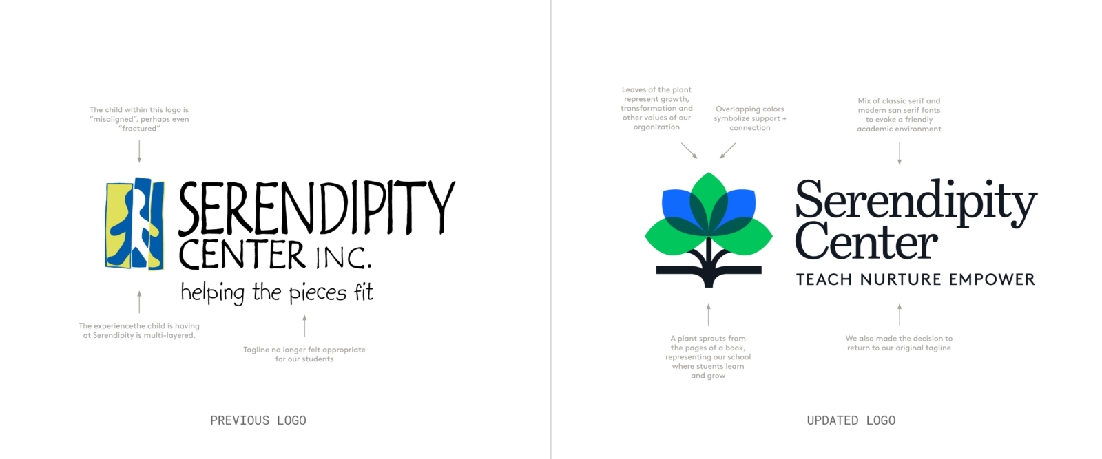
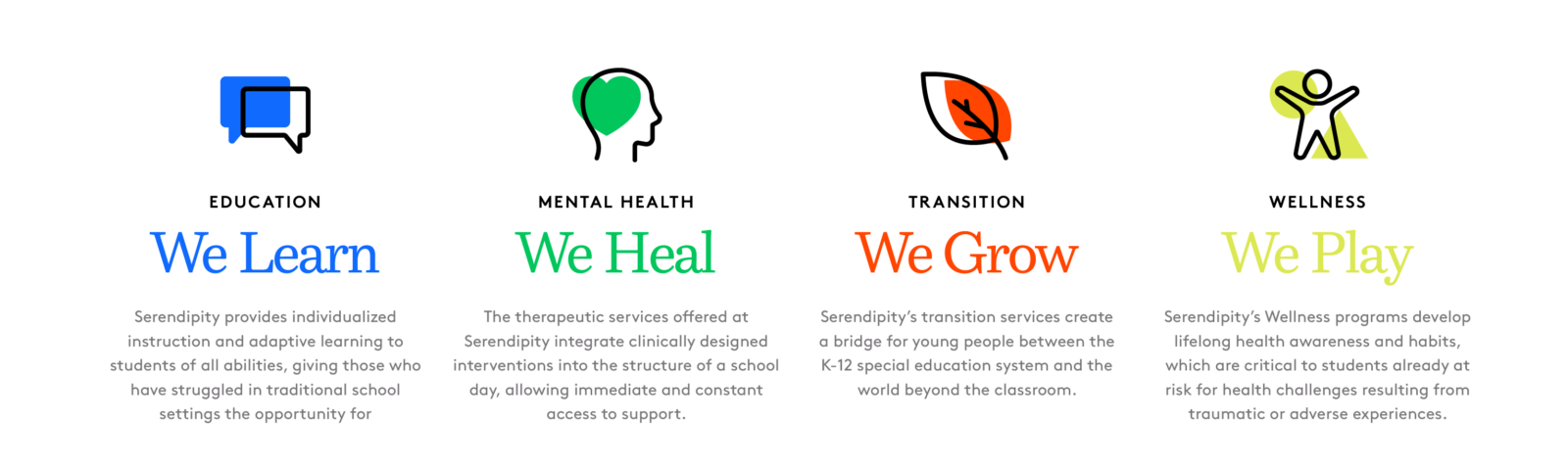
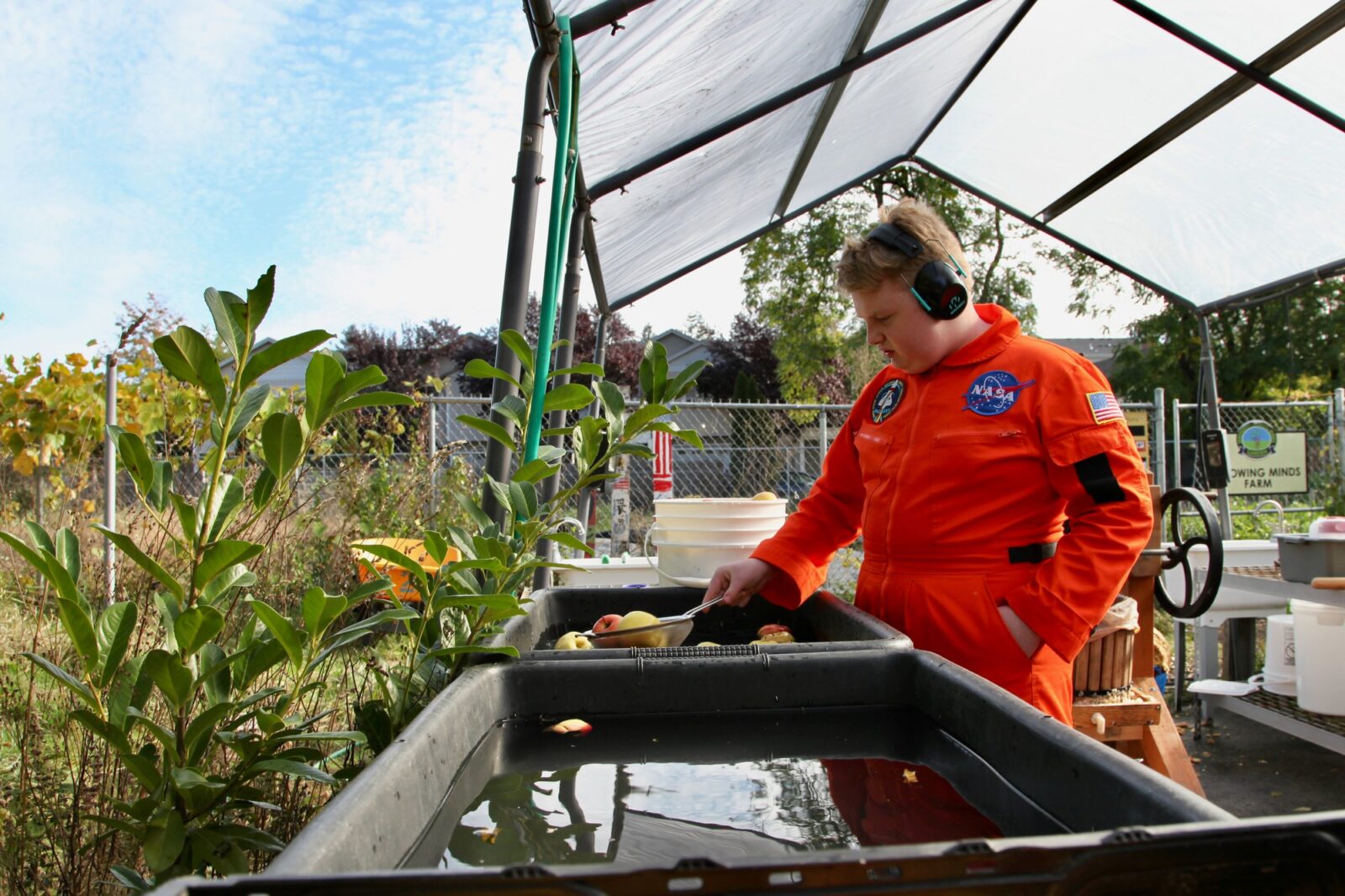
Serendipity Center is a therapeutic K–12+ school in Portland, Oregon, serving students whose needs cannot be met in traditional public settings. Its model integrates four pillars—Education, Mental Health, Transition Readiness, and Wellness—to support students academically, emotionally, and socially. After more than two decades with its previous logo, the school needed an identity that better reflected its mission: a place where young people heal, learn, and gain the tools to become confident community members. The rebrand needed to reflect a sense of dignity and care for every student, something staff, teachers, families, and students could be proud to stand behind.
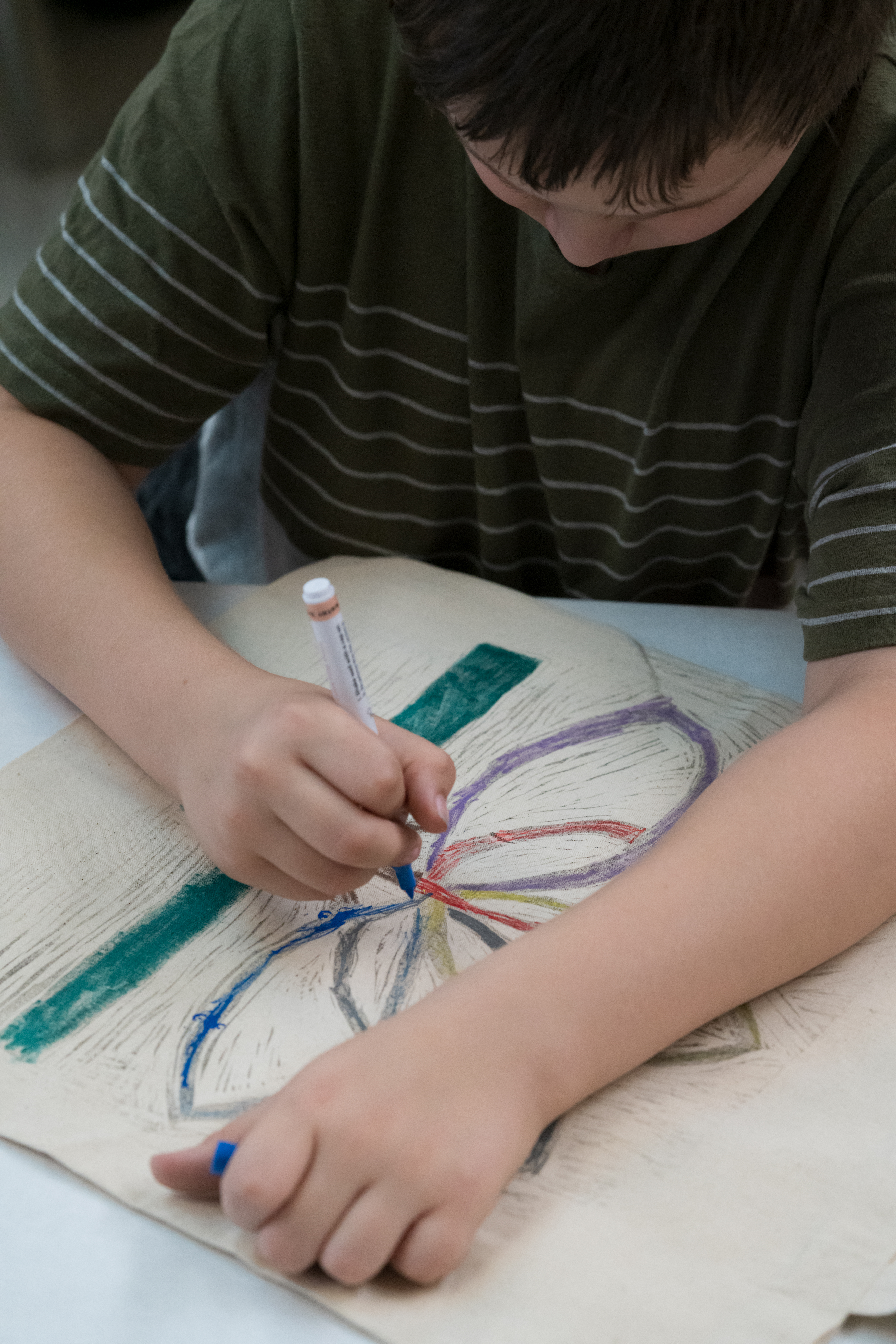

The new identity is built around a mark inspired by nature: a plant sprouting from an open book, its leaves symbolizing growth, transformation, and the support systems that surround each student. Overlapping colors echo connection and interdependence, while playful shapes keeps the system rooted in the world of children. A mix of serif and sans-serif typography brings together classic schoolbook familiarity with a modern tone. The palette expands from core greens and blues into a broader tonal system for signage, print materials, classrooms, merch, and digital tools. Throughout the process, close collaboration with staff and teachers ensured the brand felt authentic to the community it represents. The result is an identity that feels legitimate, welcoming, and deeply tied to Serendipity’s purpose: Teach, Nurture, Empower.