Rebrand
Made with supermorebetter
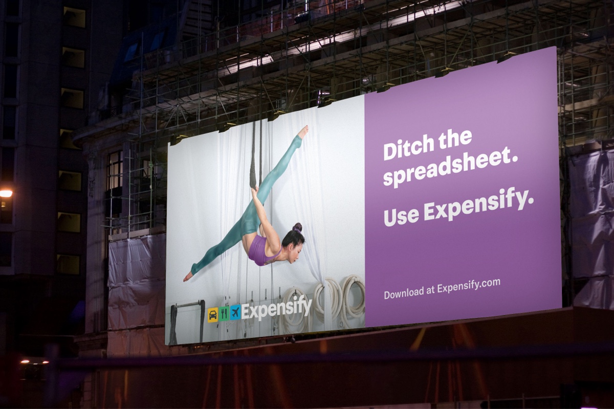
Photos: Brian Finke
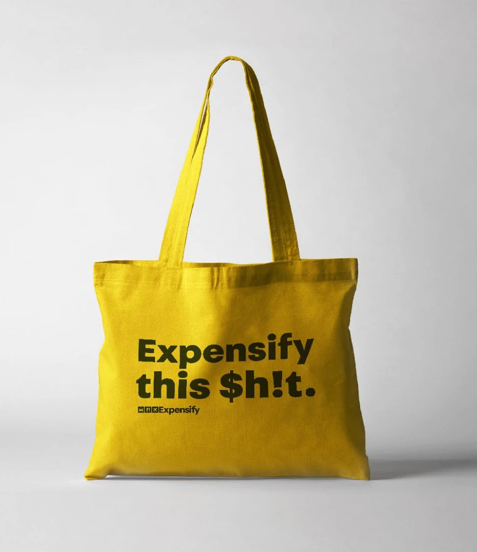
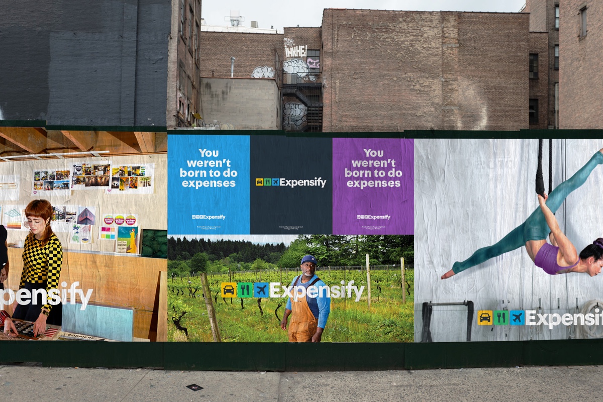
A campaign-ready brand system built around the truth that expenses suck.
Expensify needed a refreshed brand system as it prepared to reach a much larger audience, including a national Super Bowl campaign. The company already had strong recognition with finance teams and expense managers, but the opportunity was broader: to speak directly to employees and everyday users who just wanted expenses to be easier. The brand platform centered on a simple, human truth — nobody was born to do expenses — turning a frustrating task into something clear, direct, and oddly relatable.
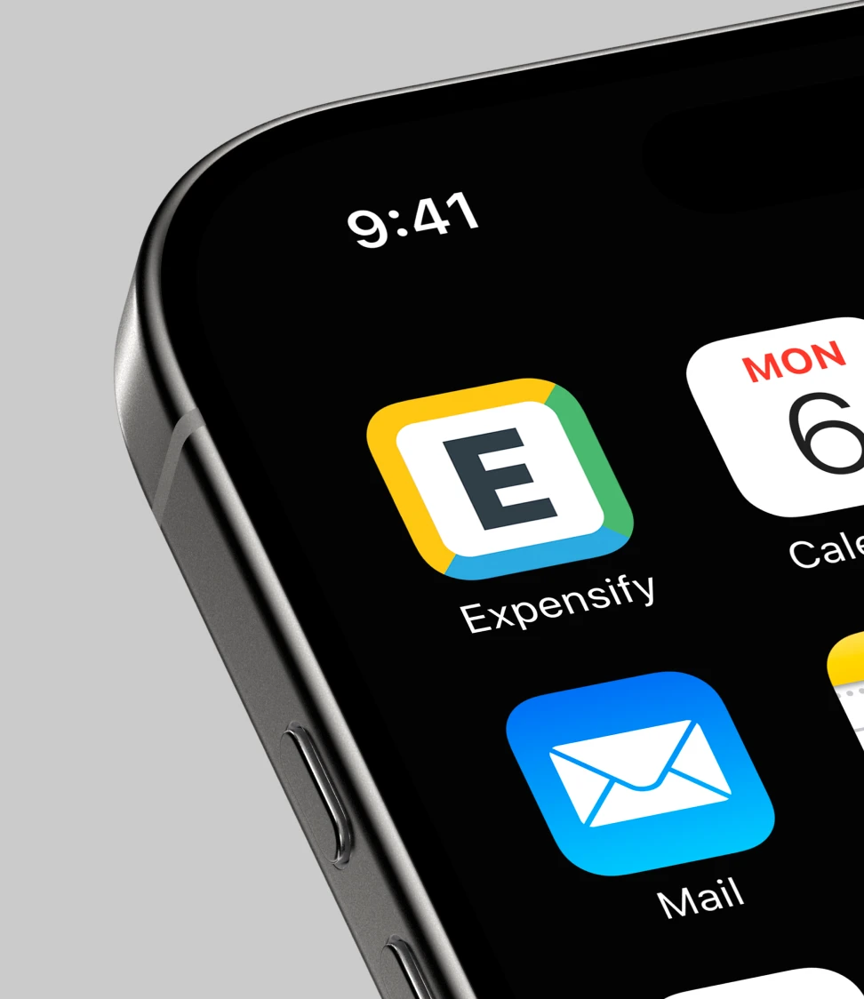
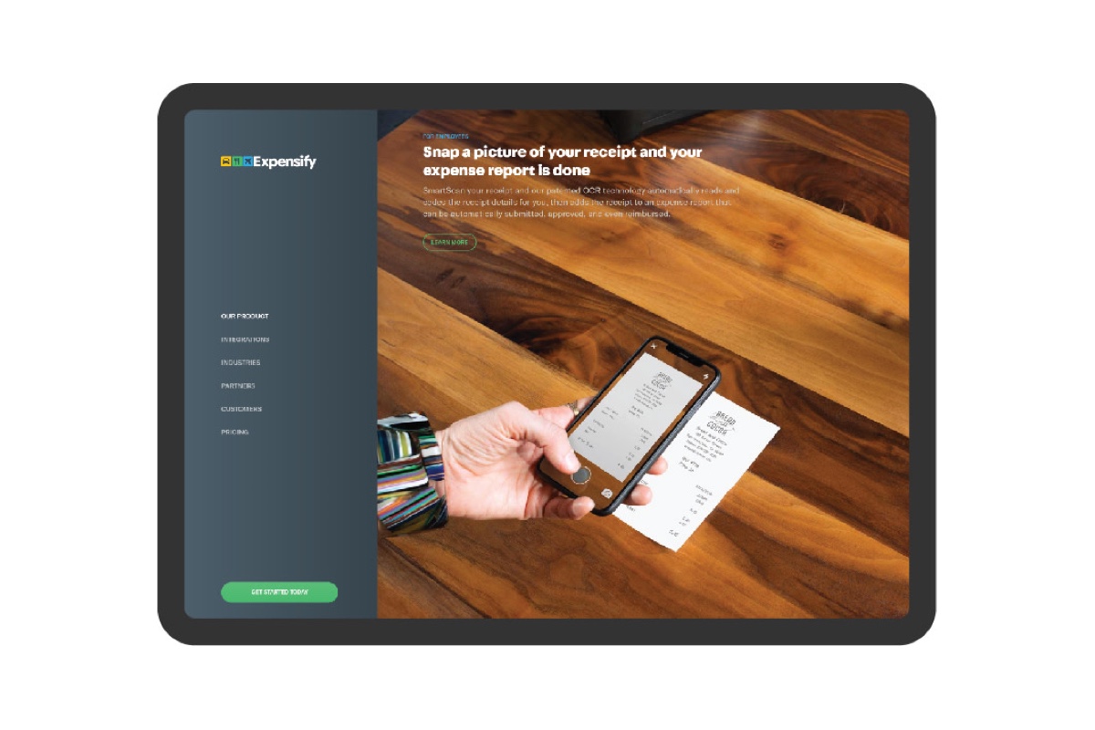
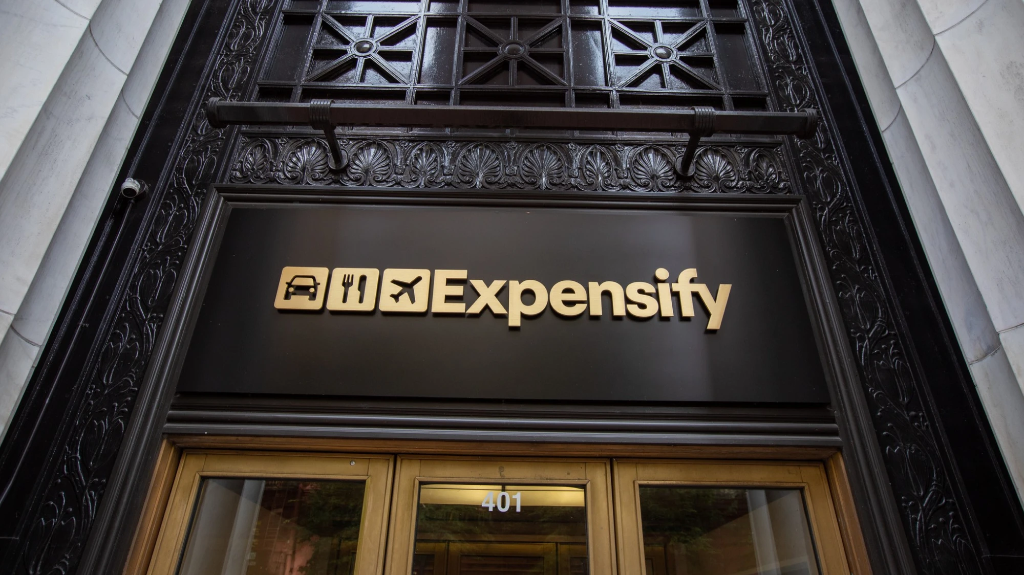
The refresh modernized the identity while keeping the brand’s personality intact. The system became brighter, bolder, and more flexible, built to work across app icons, product moments, out-of-home, campaign assets, and internal tools. Visual and verbal direction worked together: confident typography, vivid color, candid photography, and a tone that was funny without trying too hard. The photography system helped tell real user stories, focusing on people on the go, doing the work they actually care about, with Expensify quietly clearing the path.


The result was more than a logo refresh. It was a toolkit for a brand with a bigger voice: human, hopeful, a little weird, and still very practical. A system designed to make expense management feel less like software for finance departments and more like a product for people with better things to do.