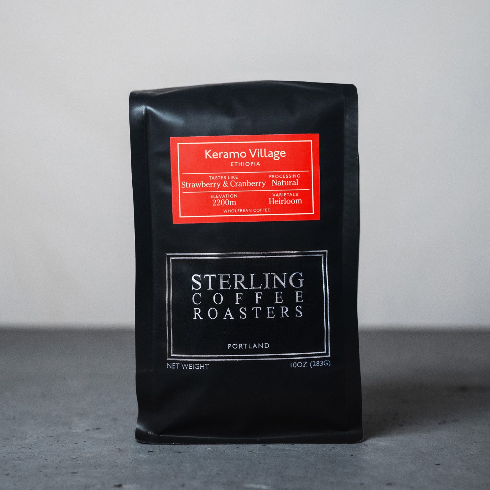
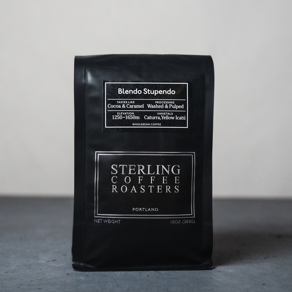
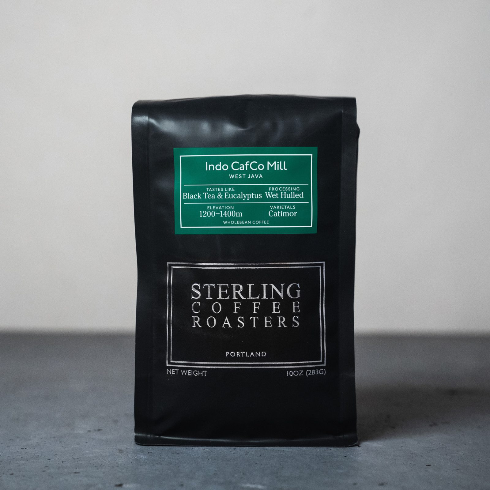
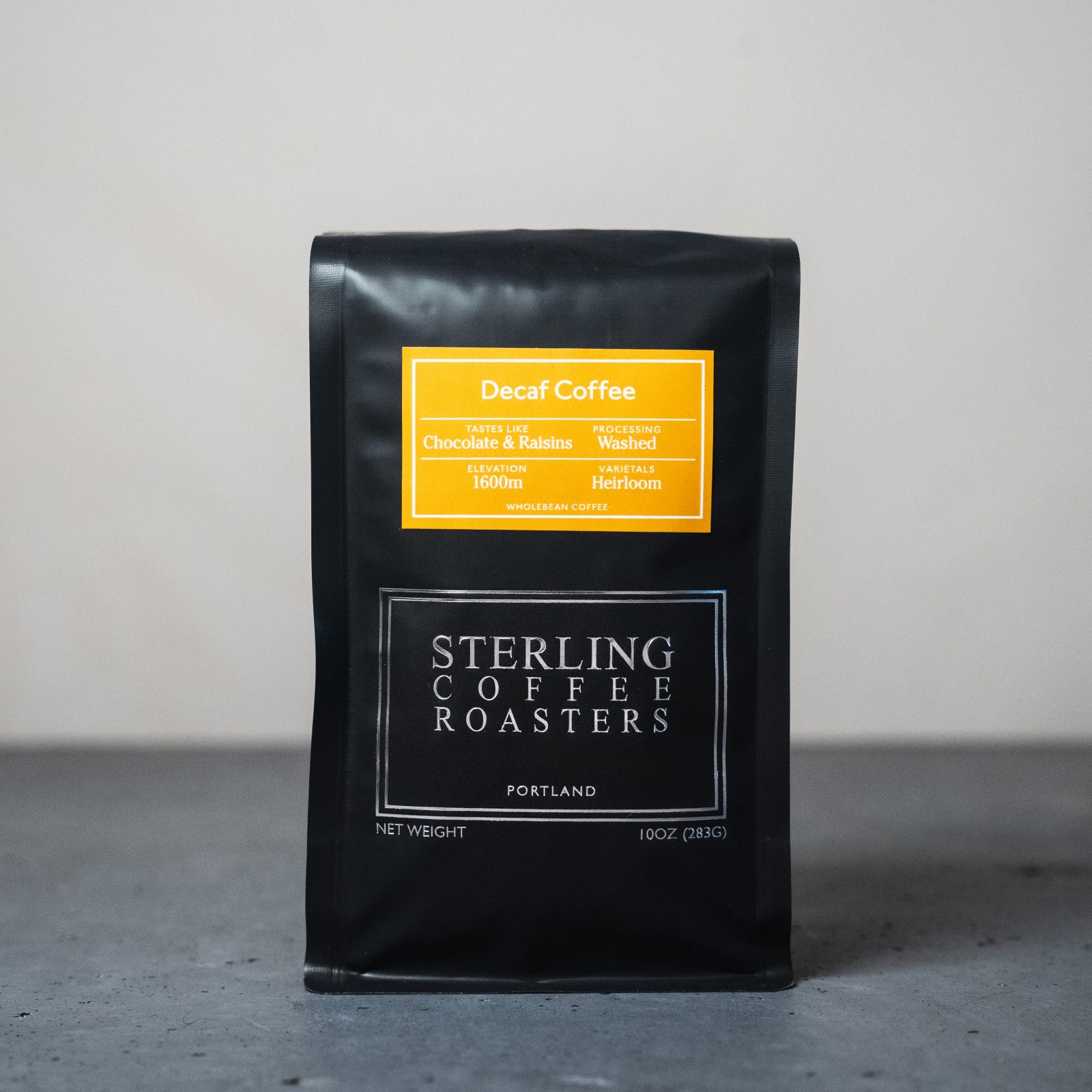
Branding
Photography by Matthew John Sutherland
A visual and strategic system reinforcing Sterling’s place as leaders within Portland’s coffee scene.
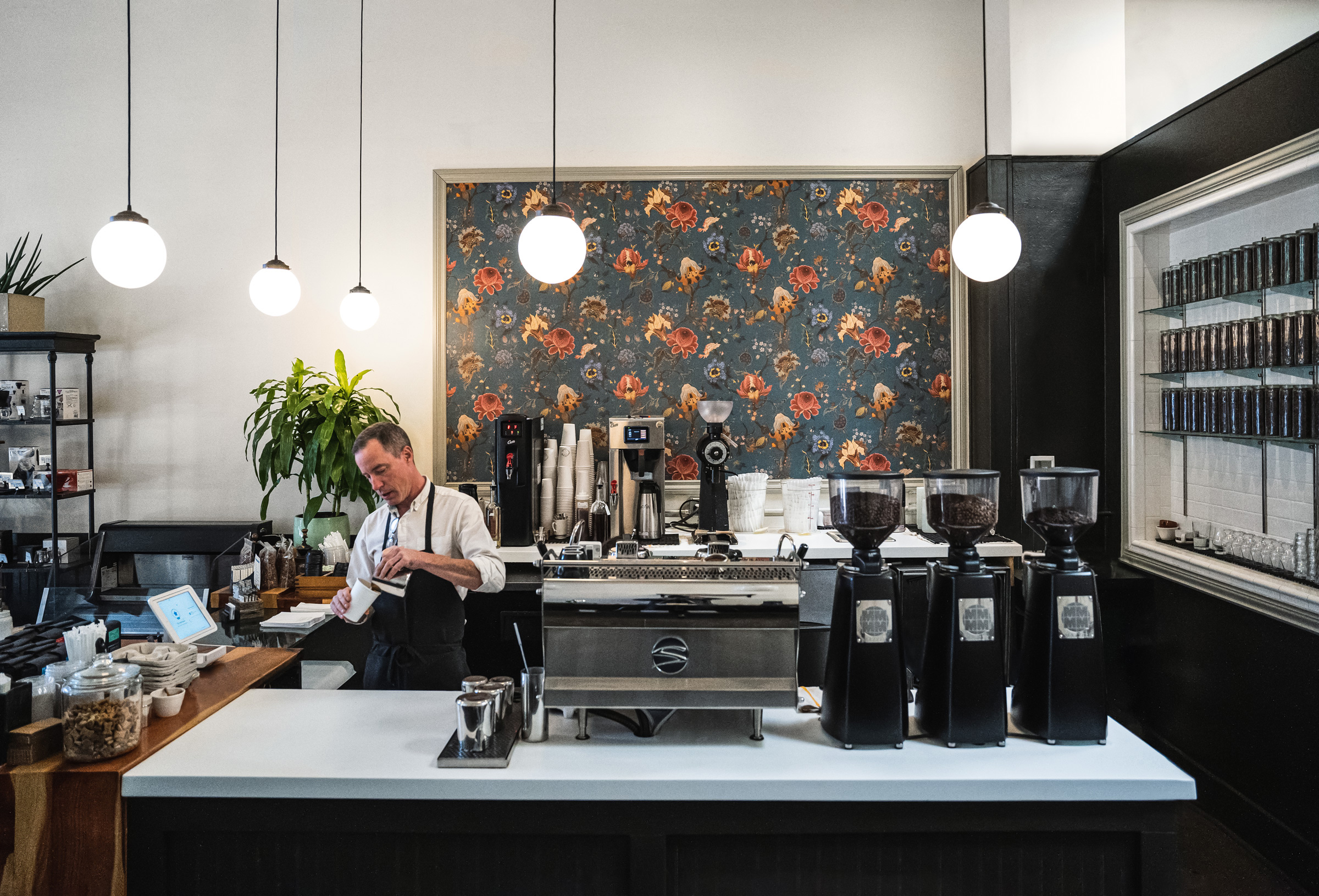
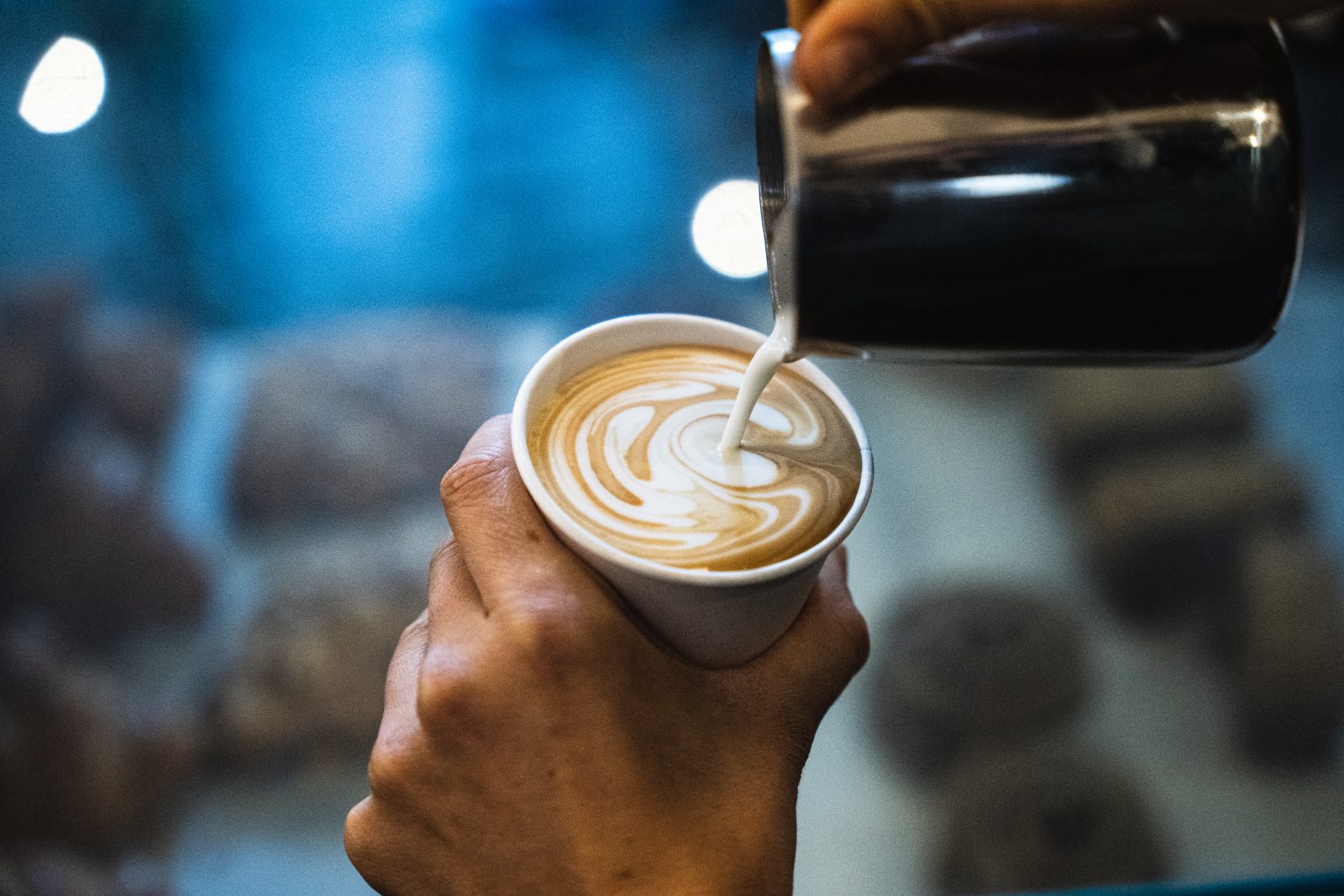
Sterling Coffee is both a neighborhood fixture and a destination within Portland’s coffee scene. Known for its global coffees, endearing formality, and attention to detail, Sterling has built a loyal following over more than fifteen years. In a city saturated with cafés, the work focused on sharpening what already existed; articulating a clear point of view that positioned Sterling as a leader in coffee community and a place visitors actively seek out.

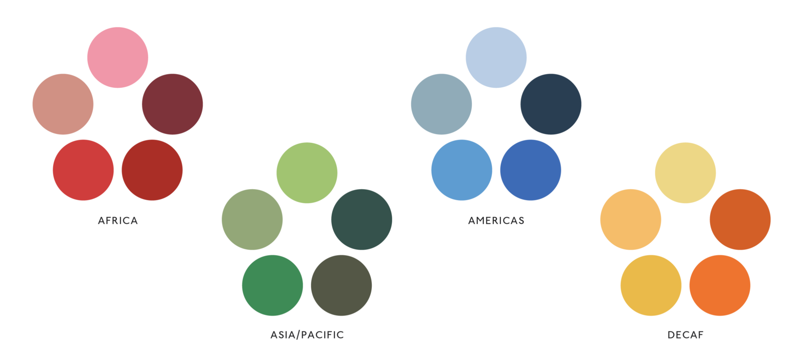
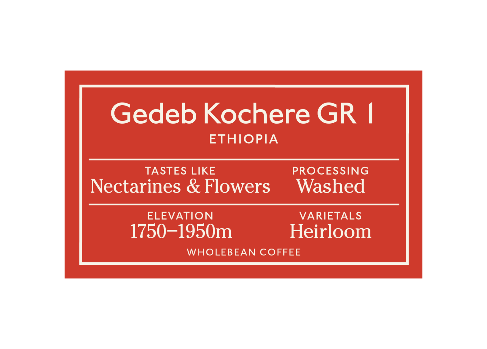
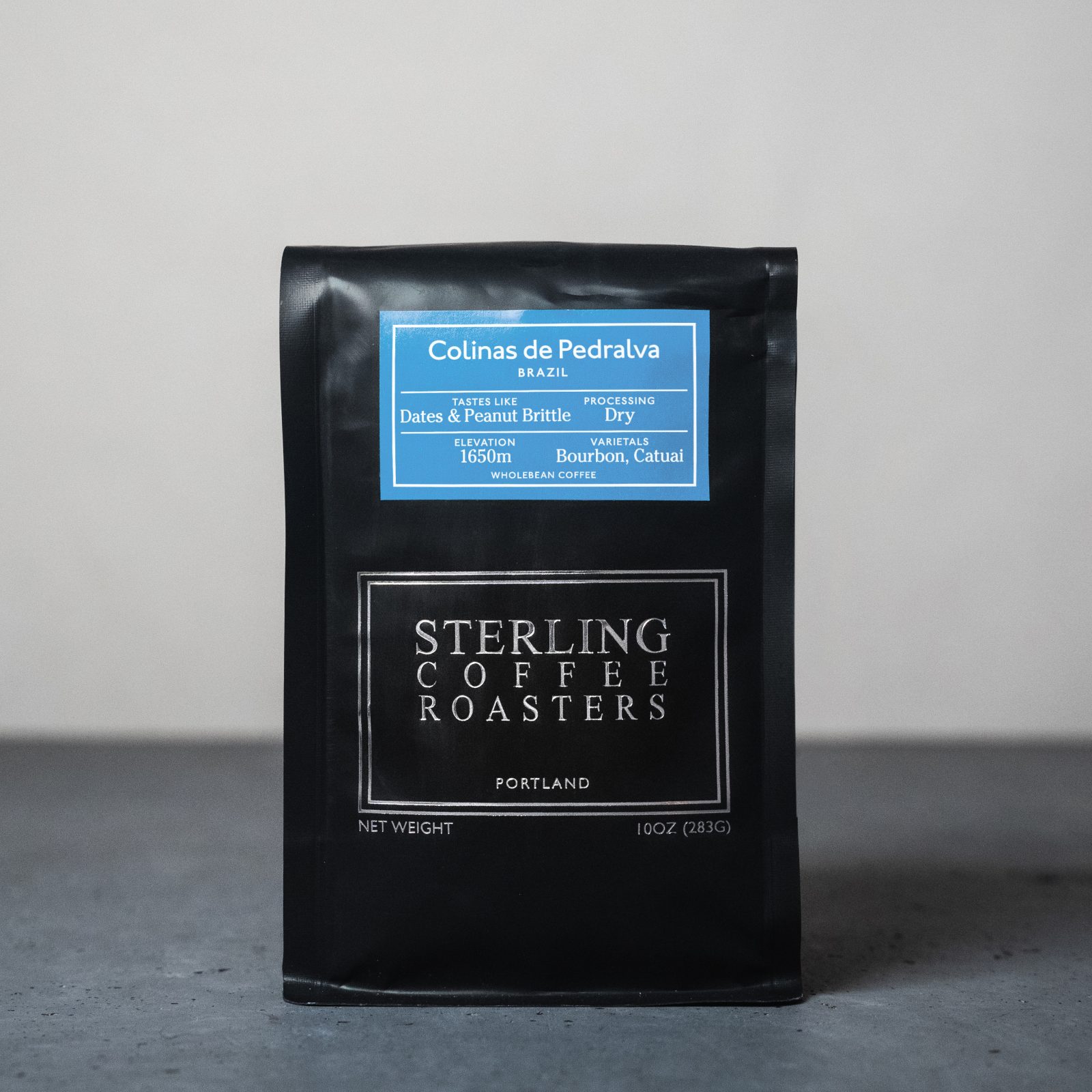
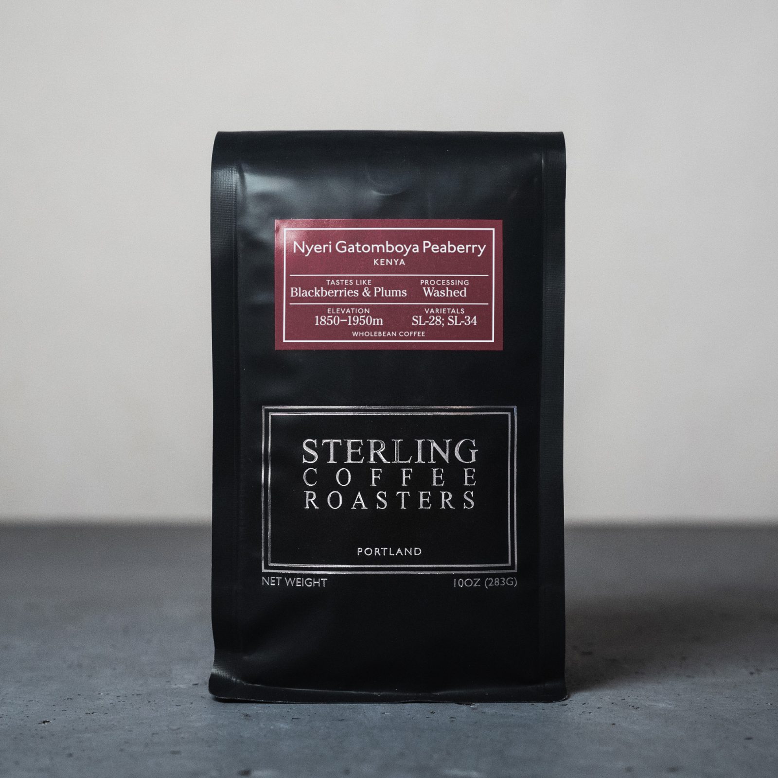
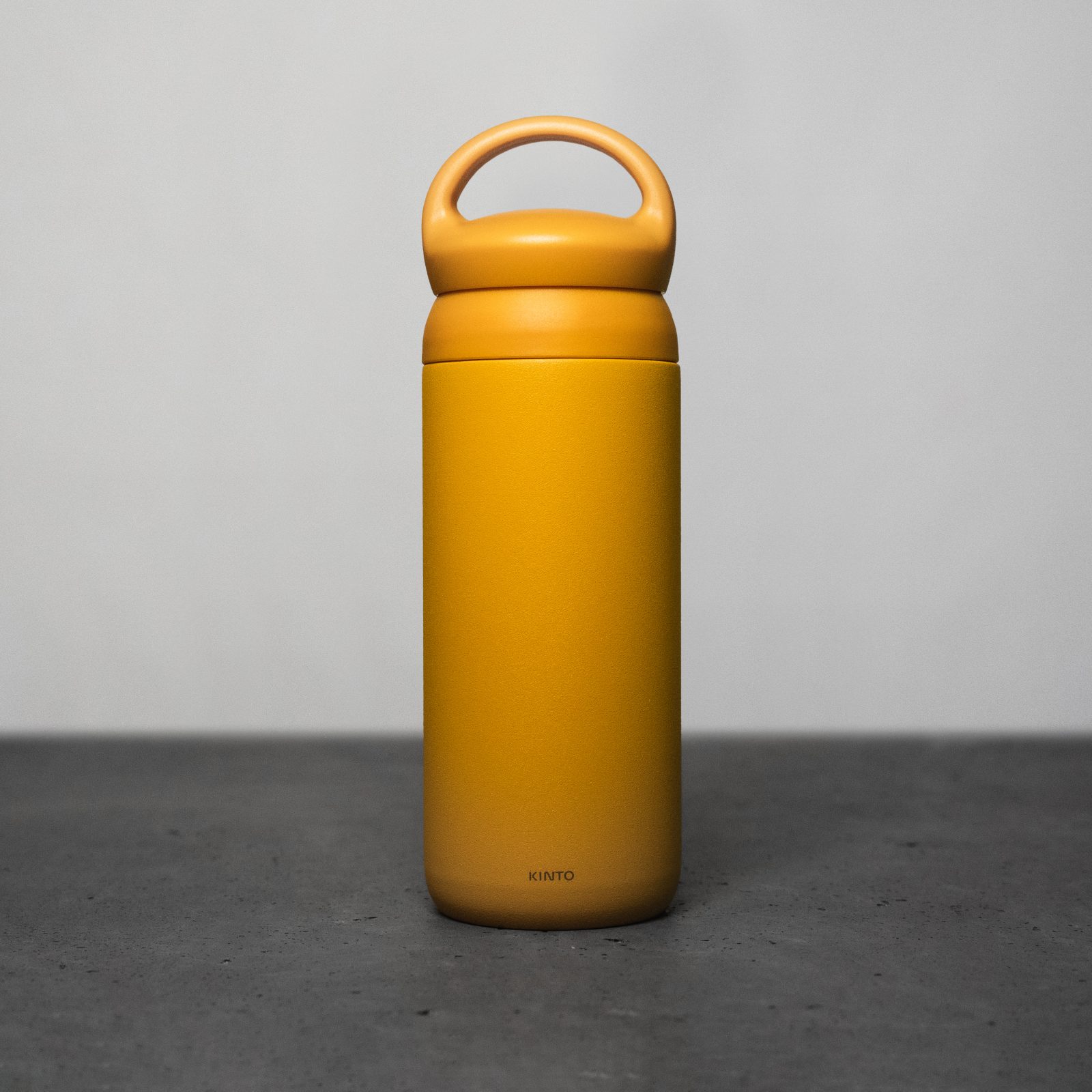
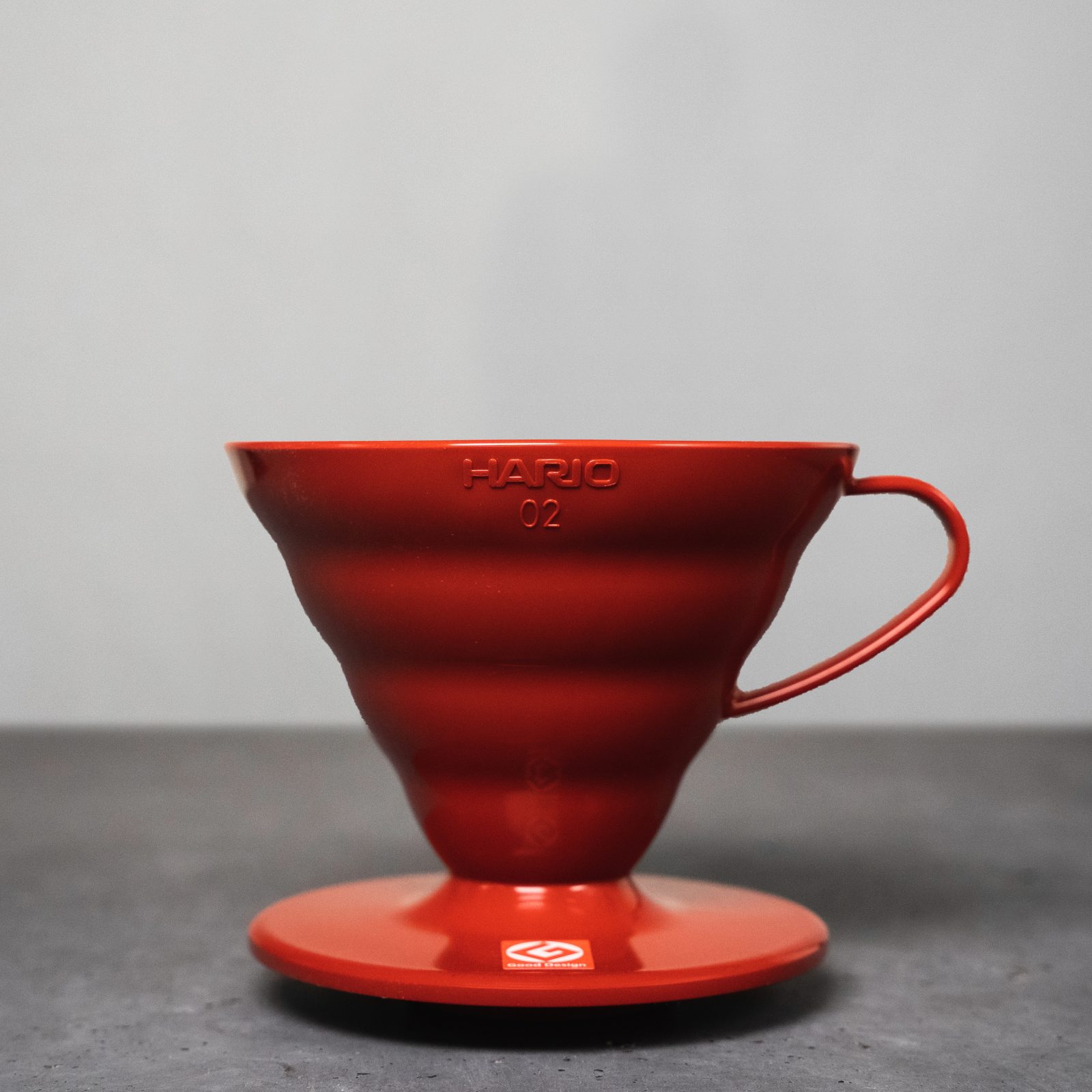
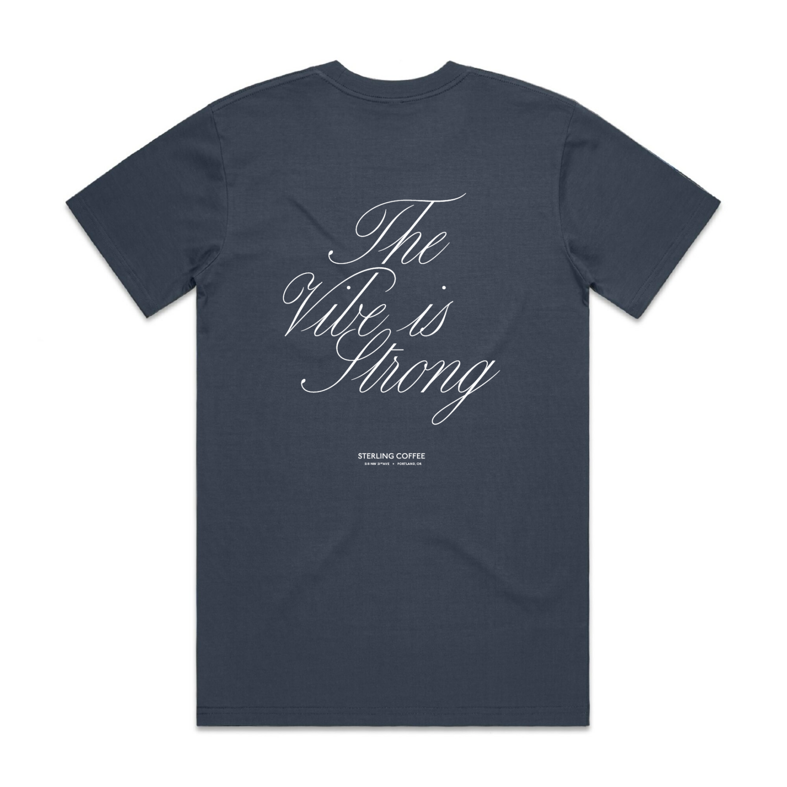
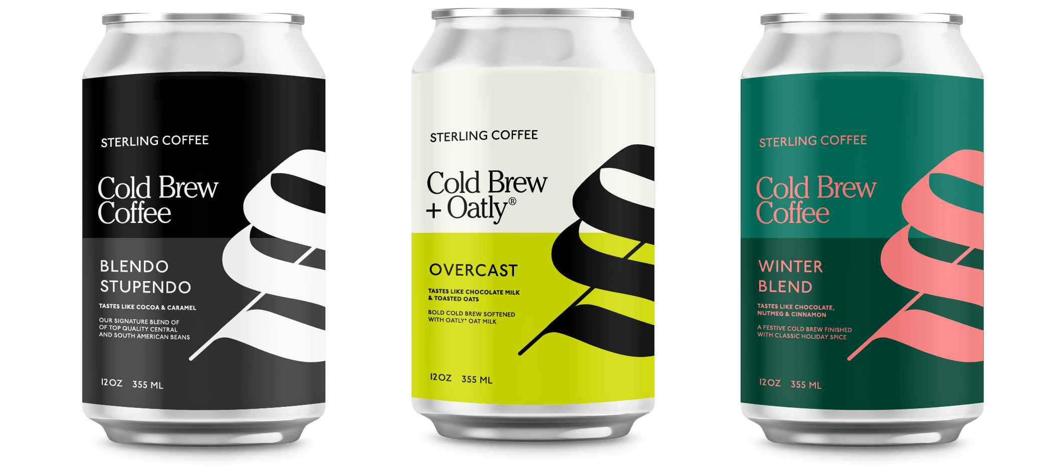
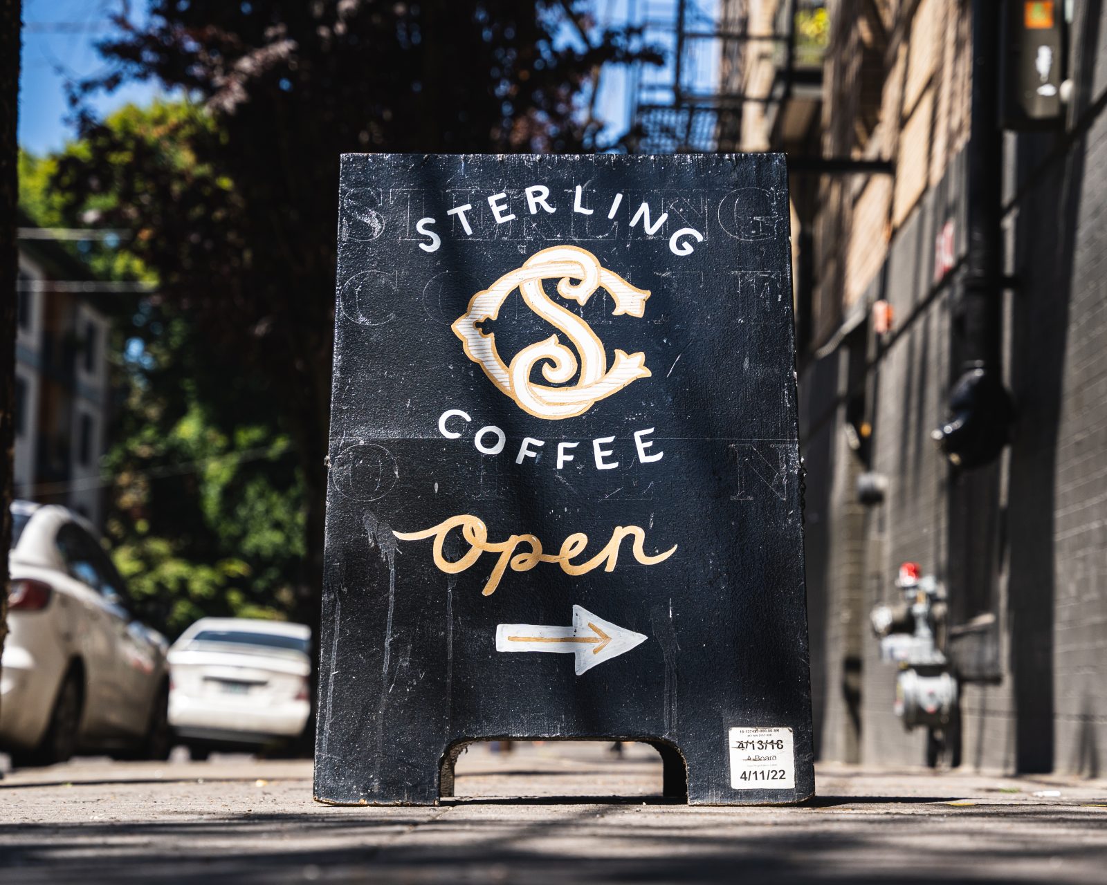
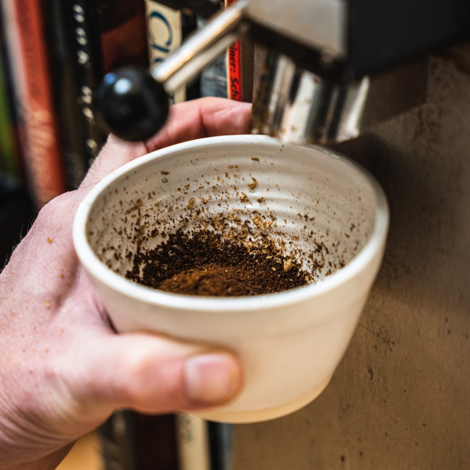
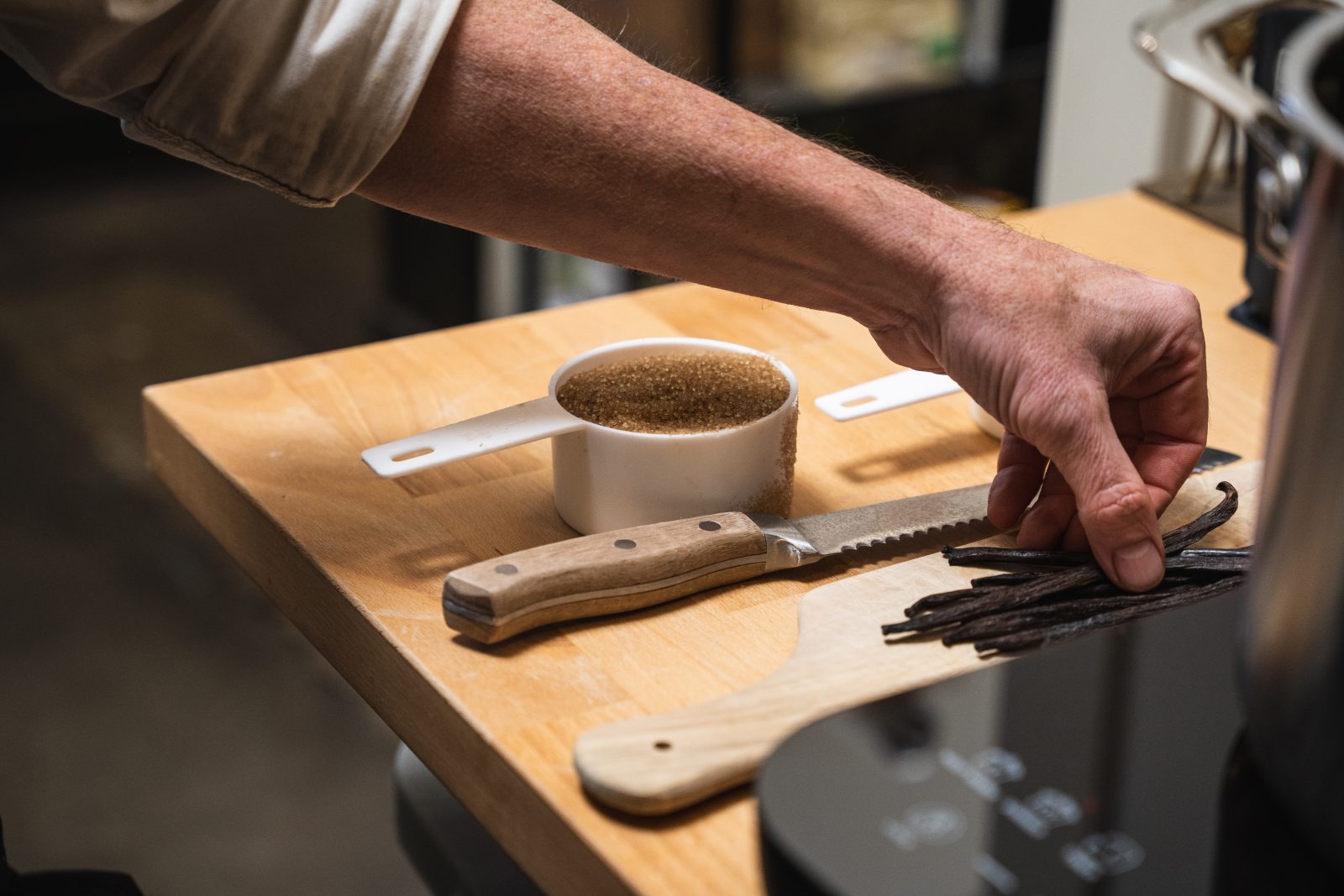
The brand strategy is built around three equally weighted pillars: Coffee, Craft, and Culture. Coffee is treated with seriousness and respect, never obscured by trend or spectacle. Craft shows up in the details; typography, materials, photography, and the way things are made and presented. Culture ties everything together, reflecting Sterling’s role as a gathering place and participant in the broader creative life of the city. Visually, the system balances restraint with warmth, formality with approachability, creating a tone that feels confident, sincere, and familiar.


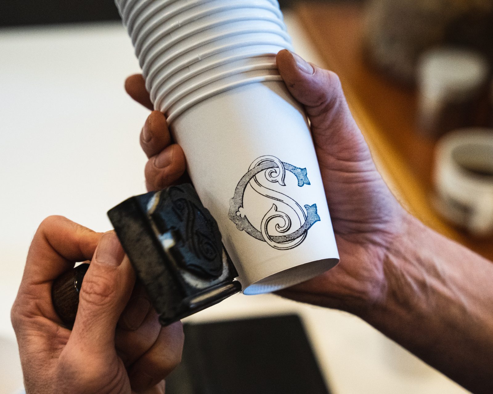

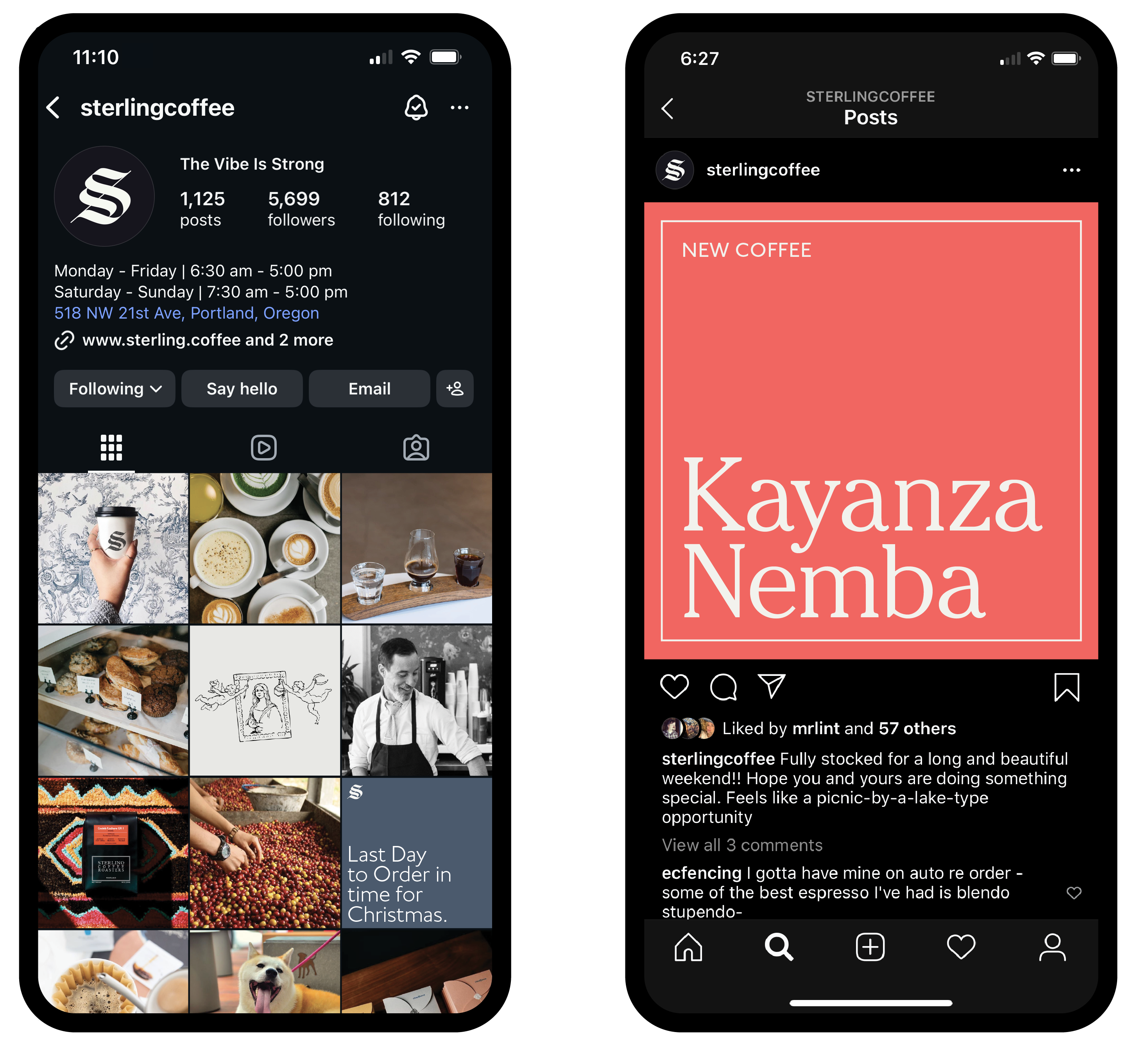
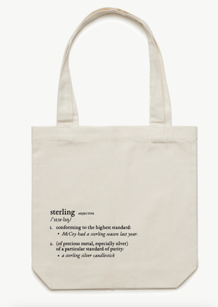
That framework extends across every touchpoint, from packaging and merchandise to the website and Instagram. The visual strategy ensures each pillar is represented consistently and in balance. Coffee, craft, and culture sharing equal weight in the feed and in the brand’s voice. Rather than chasing attention, the system relies on clarity and repetition. The result is a brand that feels composed and dependable, reinforcing Sterling as a place people return to, and recommend, again and again.